WHOOP Unite
WHOOP is a science-backed fitness wearable that helps people unlock their performance. Its primary audience is sports enthusiasts and professional athletes like Patrick Mahomes and Michael Phelps.
Having gained tremendous success in the consumer market, the company saw demand from collegiate sports teams to use WHOOP data and insights to train their athletes more effectively. In mid-2022, WHOOP launched WHOOP Unite, a B2B coaching platform.
I joined the WHOOP Unite team in September 2022 and led the user experience design for its first marketable feature - WHOOP Unite Dashboard.
Confidential information in this case study is omitted and obfuscated.
The content in this case study does not necessarily reflect the views of WHOOP.
Discover
As someone new to this space, I first listed out three questions I need to answer during my discovery phase:
- What do our customers need and want?
- How do we define and measure success?
- What data and insights do we have?
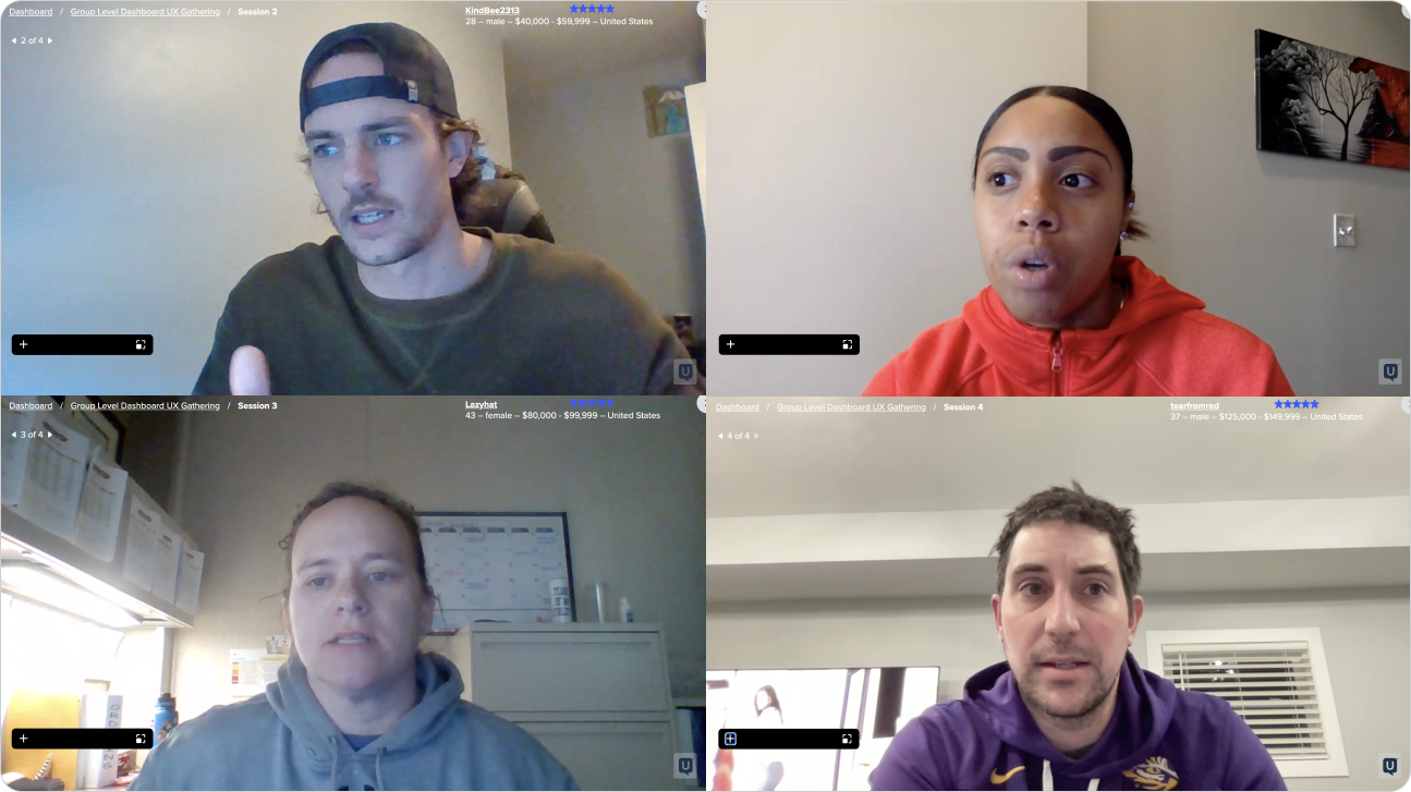
To gather information for my questions, I led a design workshop with 20 cross-functional partners and conducted user interviews with sports team coaches.
The workshop helped me understand critical themes like customization and user privacy. In addition, by seeing how different teams operate and communicate, I can pick up social cues that will allow me to build rapport with stakeholders more effectively later.
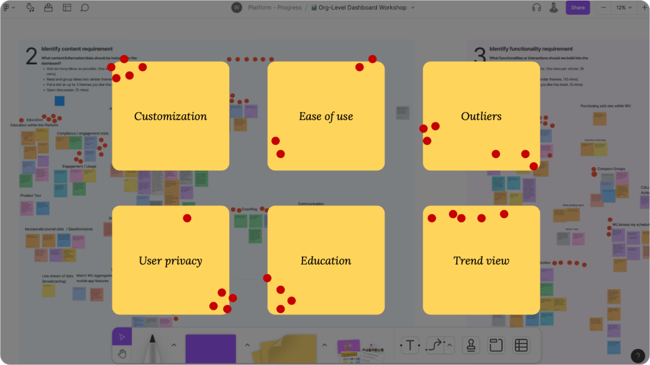
Then, from the user interviews, I discovered some user needs I had missed from the workshop. For example, I learned that coaches can't spend equal time on all players, and having a "sieve" is imperative so they know which kids really need their attention.
Define
Using the data I collected, I created four proto-personas to help the team better understand the nuanced use cases by framing them into user stories.
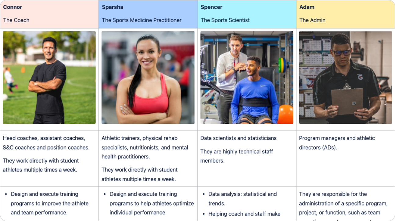
For example:
- Connor, the coach, cares about the team's performance as a whole. And his ultimate goal is to beat the rivals and win the game.
- Sparsha, the sports medicine practitioner, cares more personally about the athletes and ensures no one is injured.
- Spencer, the sports scientist, is more interested in numbers. He is the data person who dives deep into analysis.
- Finally, the admin, Adam, prioritizes compliance and measures ROIs to ensure his program grows successfully.
My second question is how to define success. To measure the success, I proposed three buckets:
- DAU/MAU for engagement
- CSAT or NPS for satisfaction
- User retention for growth
After discussing this with my PM, we decided to use DAU/MAU as our primary metrics since they are the most comprehensive and actionable.
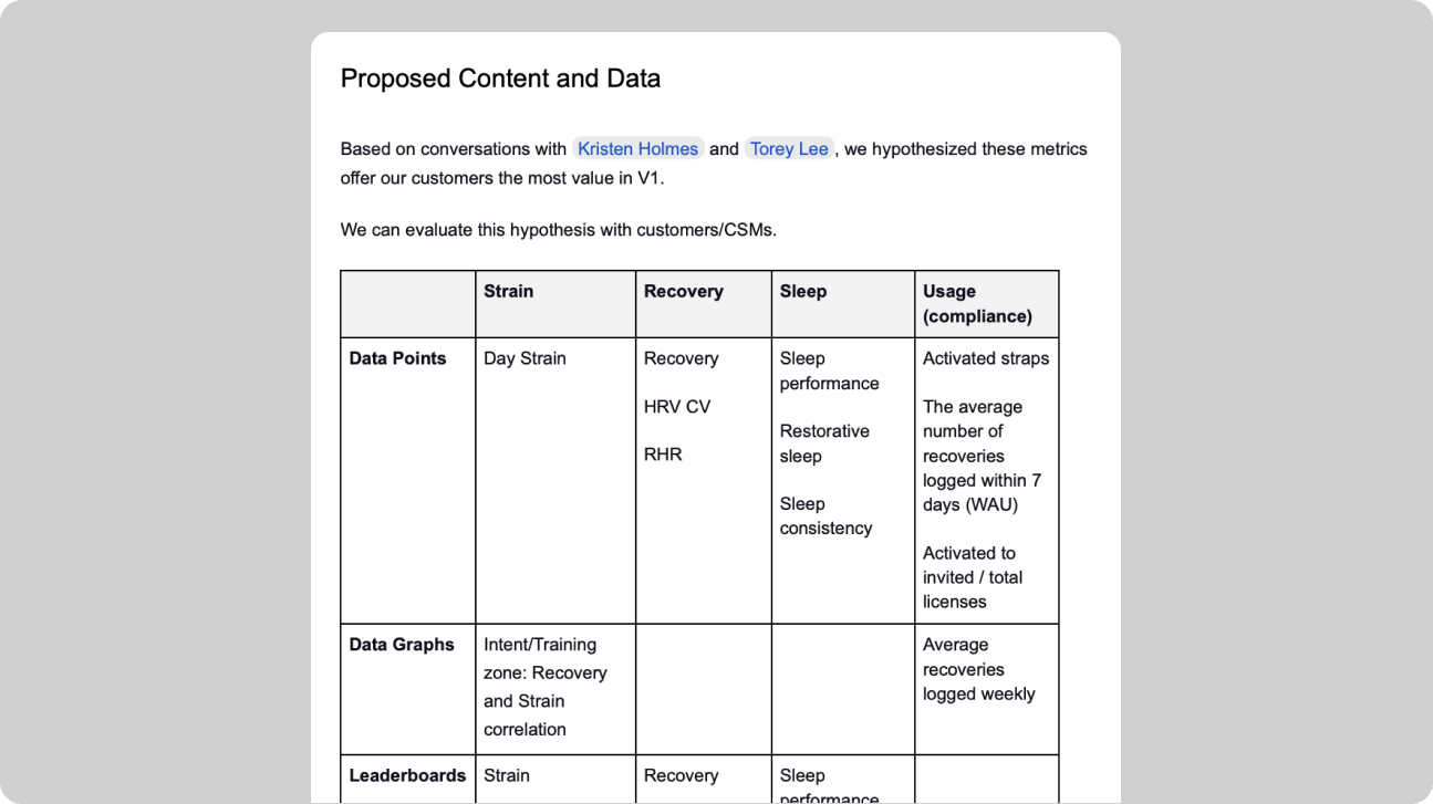
The final piece of the puzzle is understanding the data requirements. I met with our data science team to learn what data we can push into the dashboard and how to use it correctly.
Design
Based on our personas, I determined that the user experience should focus on scannability, actionability, and empowerment.
- Our users are busy professionals and sometimes work under high stress, so the dashboard should be consumed quickly at a glance.
- Our users are not all data experts, so the dashboard should provide actionable insights, not just raw numbers.
- Our users constantly look for improvement through experiments and measurements, so the dashboard should empower their learning in this iterative process.
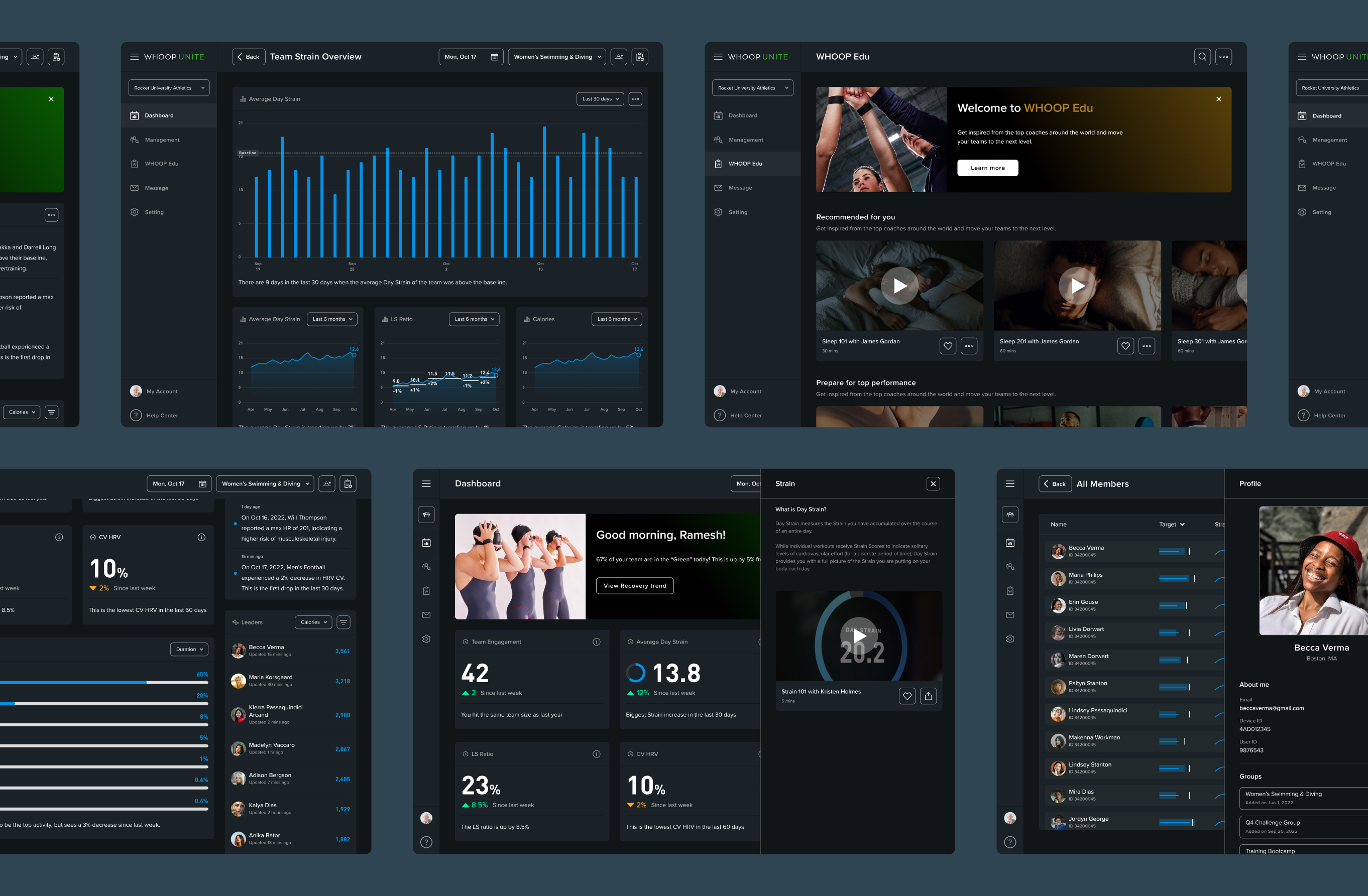
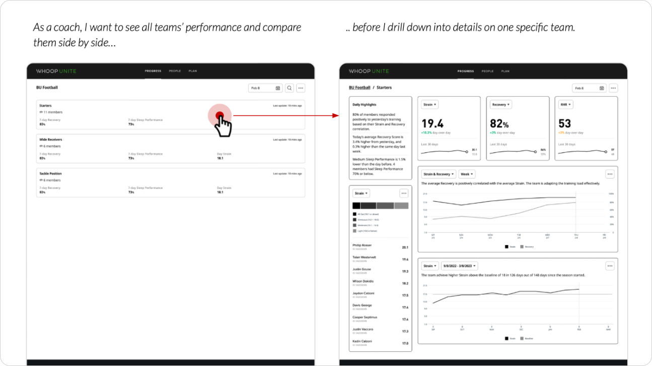
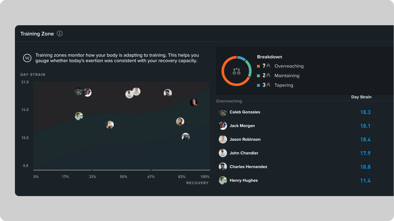
I then moved on to IA design and navigation schema. After several explorations, I finally settled on this solution, which empowers coaches with an A/B testing tool. It allows them to separate players into two or more teams and improve their training programs through trial and error.
Finally, I explored a variety of features for the dashboard. Ideas that stood out are:
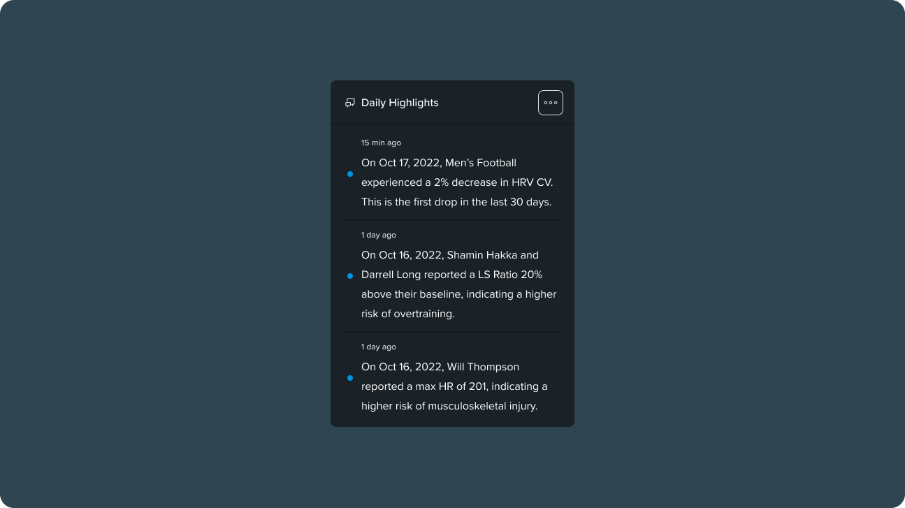
- Daily Highlights
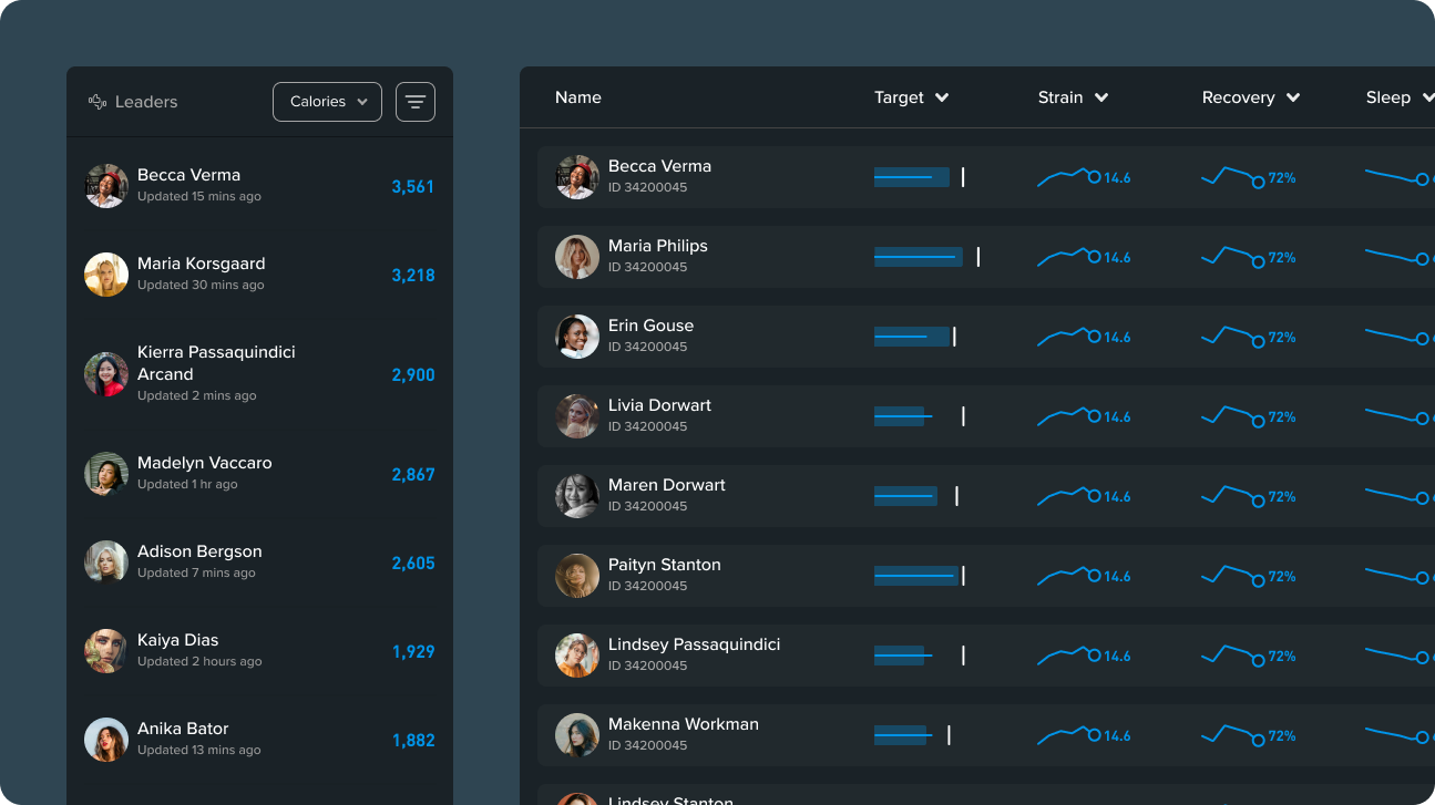
- Leaderboard
- Voice of WHOOP (VOW)
Iterate
I made several rounds of iterations based on feedback during my design process. There are two sources of feedback:
- Feedback from customers through usability tests
- Feedback from peers through design reviews
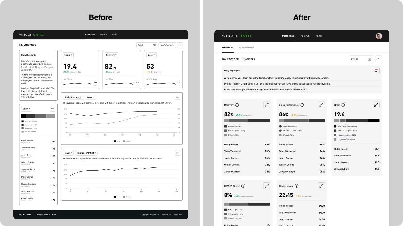
For example, when I showed my dashboard wireframes to my engineers, they told me that "the variable card sizes require higher engineering effort." To help them speed up the dev velocity, I redesigned the cards to be the same size and layout, making them easier to build and reuse as a single UI component.
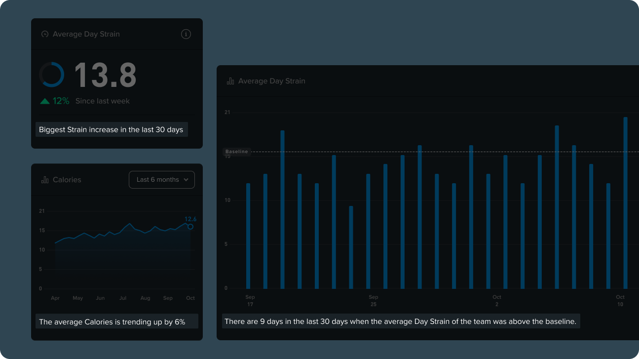
Another feedback I got from user testing is that triangulation between Strain and Recovery is critical for coaches. So I partnered with the data science team, and we developed a new metric just for WHOOP Unite, called Training Zone, which shows the correlation between Strain and Recovery.
This simple graph empowers coaches to see who is overtrained and who is tapering. With this knowledge, they can prescribe the player load more effectively.
"I can trust Weinan more, because he doesn't bullsh*t."
by Will, CEO of WHOOP, during an executive design review
—
Outcomes
WHOOP beta-launched the product in June 2023.
The project had three positive impacts on the business:
- The product's DAU/MAU metric increased from 13% to 49%. On average, users open the dashboard three times each week, up from three times a month previously.
- The CS team showcased the product to prospective customers at a sports tech conference, driving the total number of enterprise accounts to XXXX by the end of January 2024.
- In Q3 2023, WHOOP's CEO demoed WHOOP Unite to the US Air Force, paving the way for future market expansion into non-athletic users.
It wouldn't be a day without challenges at WHOOP. Among all the setbacks and successes, my two major takeaways are:
Customer services have a wealth of knowledge about the users. Partnering with them during the research would help you offload some heavy lifting.
Focusing on the goals, not the requirements, helps you stay adaptable without losing sight during the time of changes.