Insurify Auto Flow 2.0
Insurify is an online insurance agency that helps customers find, compare, and purchase insurance in one place. It connects carriers with shoppers through its website and mobile app as a two-sided marketplace.
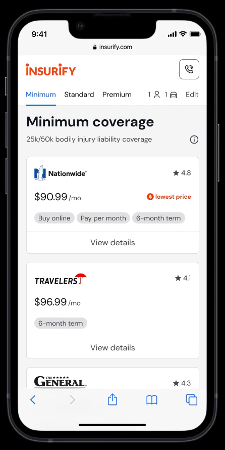
Insurify has three product verticals: auto, home, and life. Auto Flow is Insurify's core experience for finding and comparing car insurance, where new users fill out several pages of questionnaires and receive initial quotes from different carriers.
Auto Flow 2.0 aims to revamp the experience with a focus on user needs and business goals.
Confidential information in this case study is omitted and obfuscated.
The content in this case study does not necessarily reflect the views of Insurify.
Discover
To understand our business goals and team priorities for Auto Flow 2.0, I first conducted a vision survey with 11 stakeholders. The learning helped me to plan my focus area in user research.
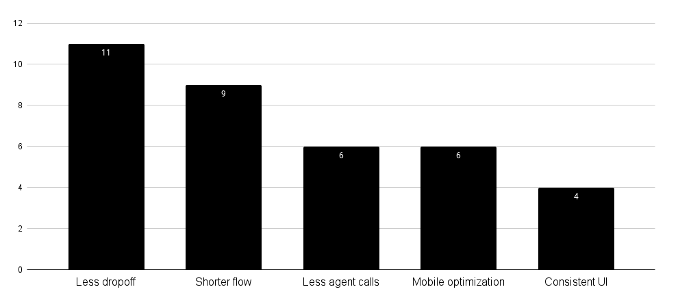
Of all the comments from the survey, the one on the excessive amount of agent calls caught my attention. After interviewing a call center team member, I learned that most customers called in for two reasons:
- They need help with specific questions during the flow
- The final price is more expensive than their initial quote
Now knowing something was wrong with our flow experience, I looked at the existing design and pinpointed three hypotheses based on the best practices:
- Visual noises and unhelpful pixels undermine trust and cause early abandonment
- Long forms lead to cognitive overload and make users drop off
- The use of insurance jargon results in wrong user input and poor quote quality
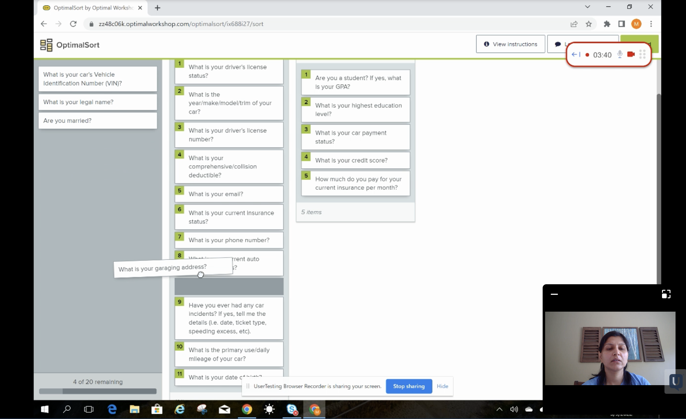
I then conducted a contextual inquiry with five users and collected qualitative data to re-baseline my understanding of the usability issues.
By observing the users going through the flow, I identified three additional design issues:
- Error validation in the form field is poorly designed
- Excessive scrolling and tapping are required to advance the flow
- Inconsistent UIs remove users from a coherent experience
While these issues didn't prevent users from completing the task, they posed great opportunities.
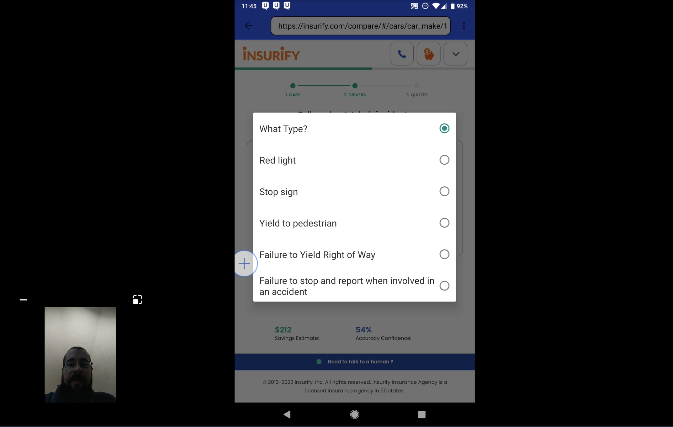
Finally, I used card ranking to gauge how users responded to our questions emotionally. For example, one lady reacted very strongly to a question asking for credit scores: "I don't know why you ask this. It feels like discriminating against people with lower scores, who are not necessarily bad drivers." Again, the output gave me good insight into rethinking our flow and content design.
Define
I created three HMWs to anchor the project focus by combining the knowledge and learnings from the Discover phase:
- How might we help users complete the flow faster without harming the quote quality?
- How can we make the experience more friendly for mobile users, which account for ~70% of our total traffic?
- How can we help users understand the questions and provide the most accurate input?
Together with the product manager and the data analyst, we defined a list of metrics to track success:
- Page conversion
- Completion rate
- Task completion time
- Quote quality score
- NPS
I also proposed the "number of taps a mobile user takes during the flow" as a UX metric. But due to a technical challenge, it was difficult for the analytics team to track it.
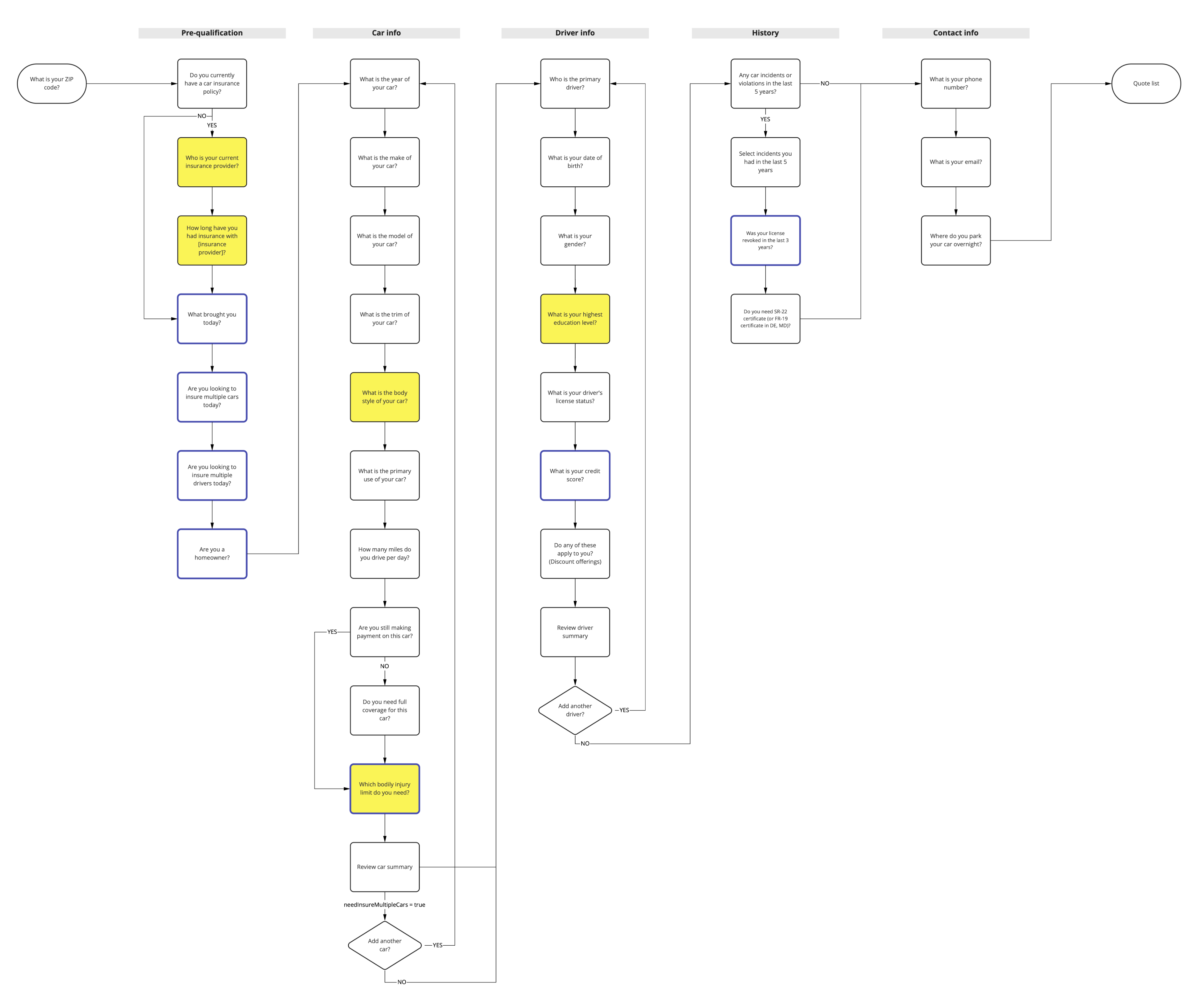
User Flow
I had no prior insurance experience, so making a sound judgment on my own was tough. To leverage the knowledge of insurance experts on the team, I hosted a brainstorming workshop and paired subject matter experts with designers.
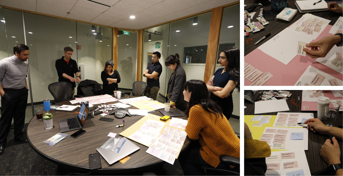
I used paper cutouts during this hands-on workshop and asked teams to remap our current auto flow to address the HMWs.
The team looked at our auto flow from various lenses, including design, content, SEO, and business logic. As a result, we established a shared understanding of Auto Flow and agreed to pursue the following ideas:
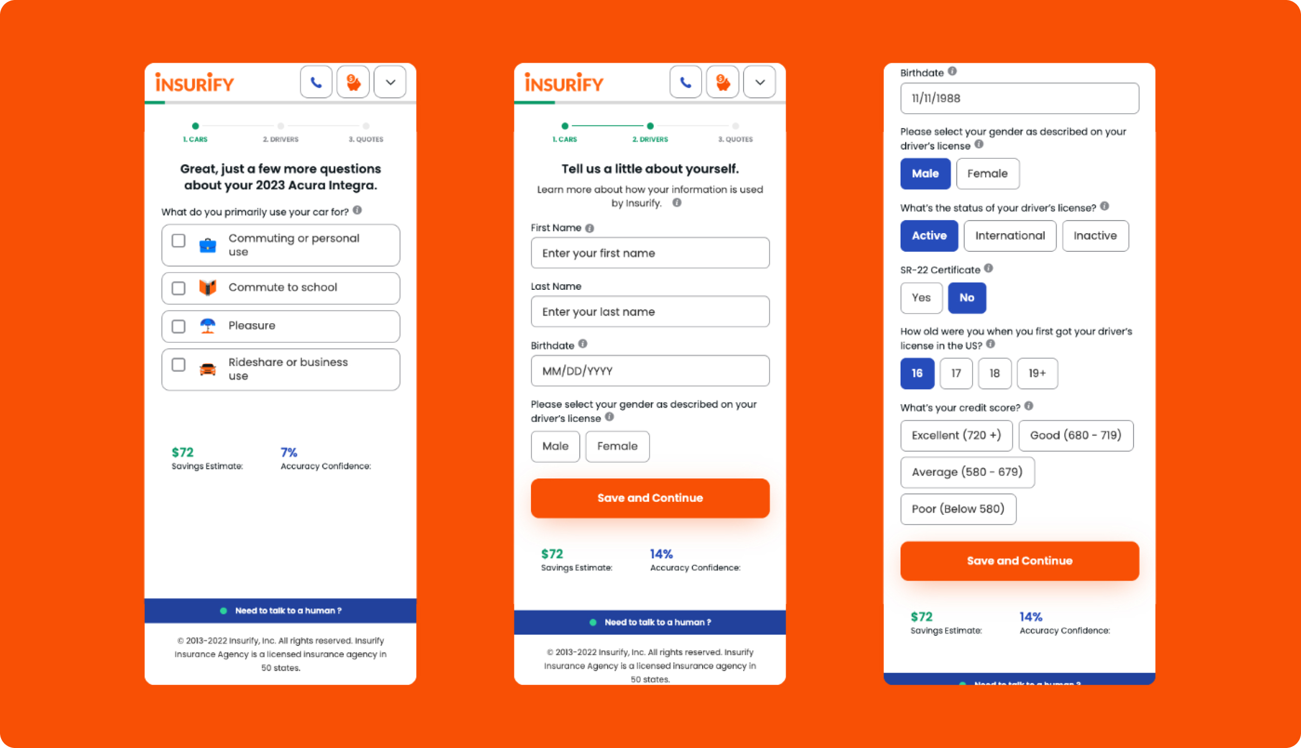
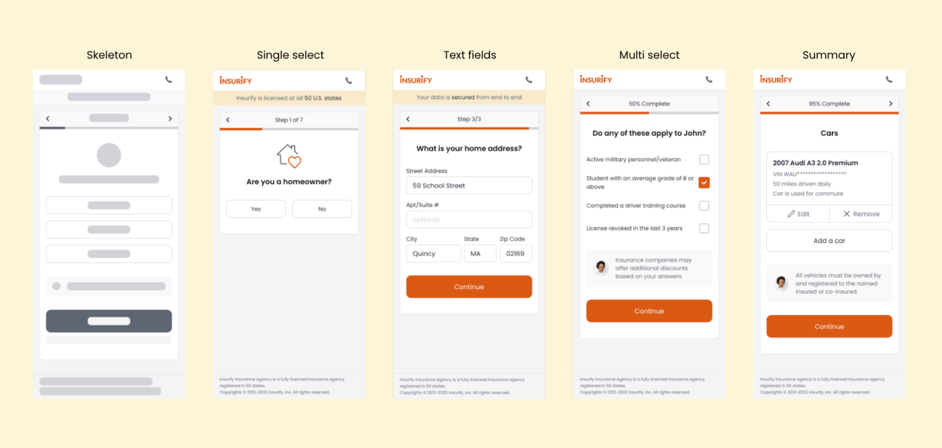
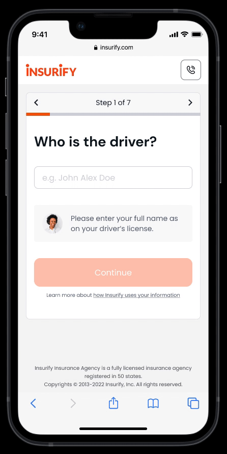
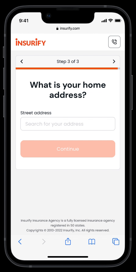
- Ask one question per screen to reduce cognitive load
- Show easy questions early on to boost engagement
- Defer personal and sensitive questions
- Improve smart defaults and conditional logic
- Use summary pages to celebrate milestones and review inputs
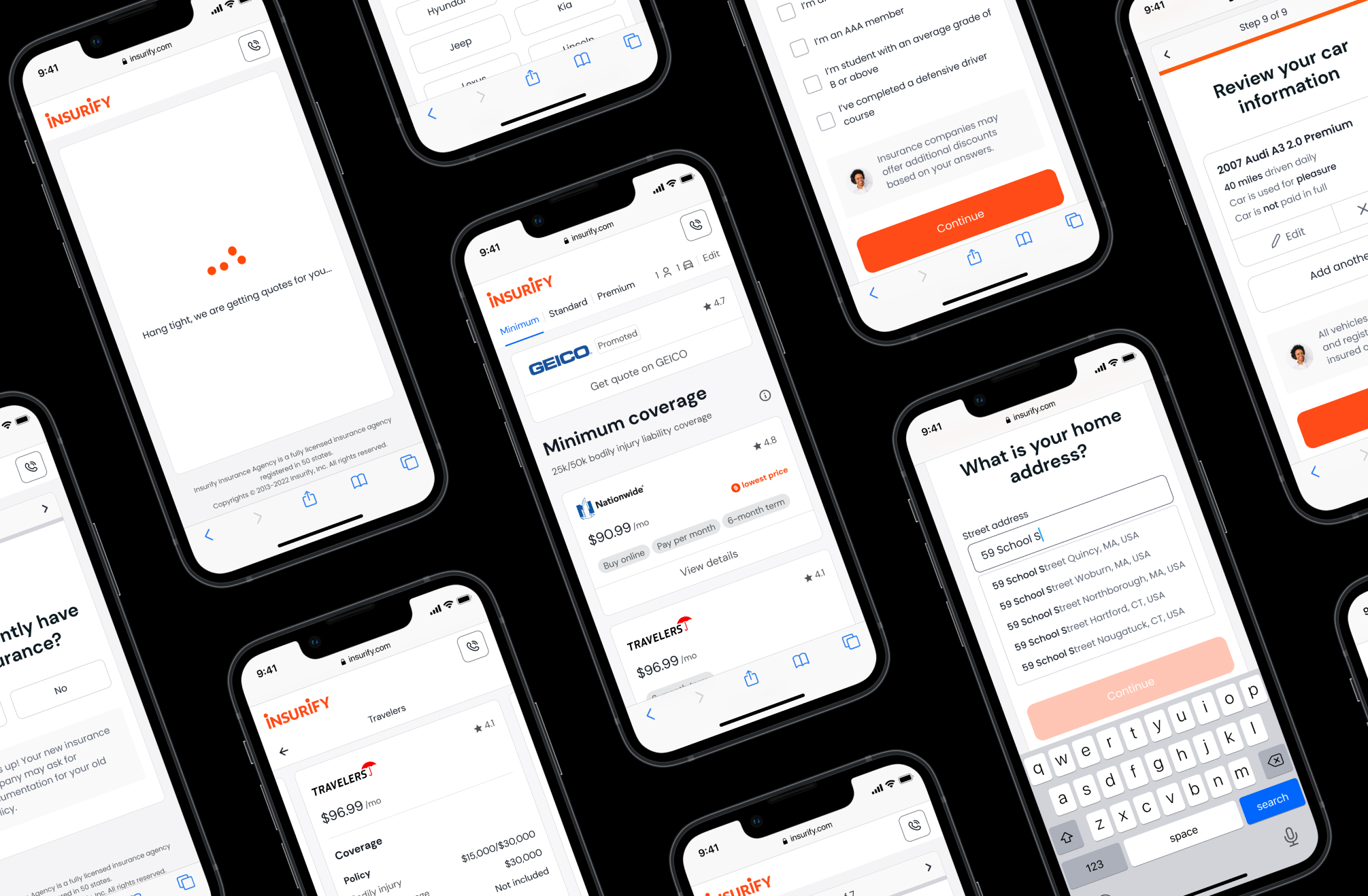
UI Design
After examining all task types and defining the required UI elements, I built a framework that houses every global and action area element.
The global elements live in a persistent UI region throughout the entire flow:
- Header
- Banner
- Main action area
- Footer
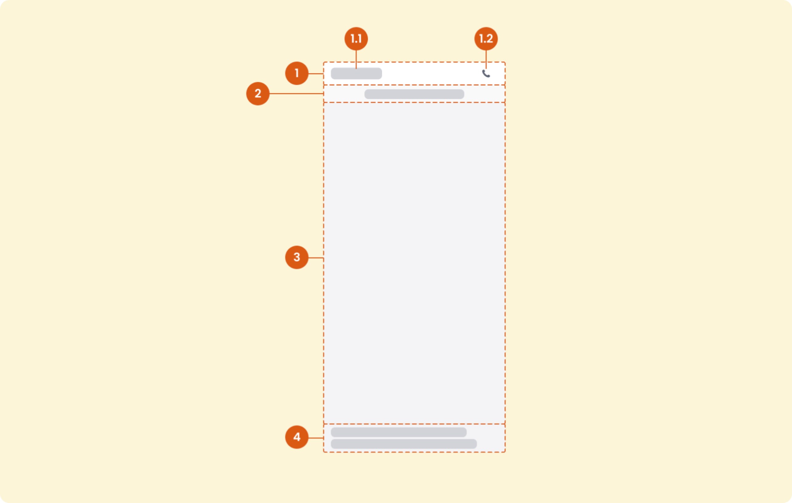
Action area elements live in the main action area and serve various design needs based on question types. These elements include:
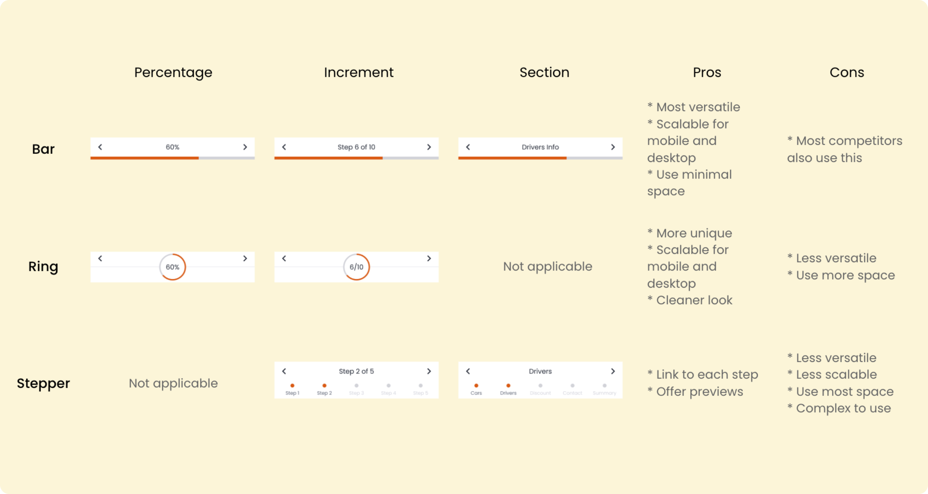
- Progress indicator and navigation
- Title area
- User input area
- Info box
- CTAs
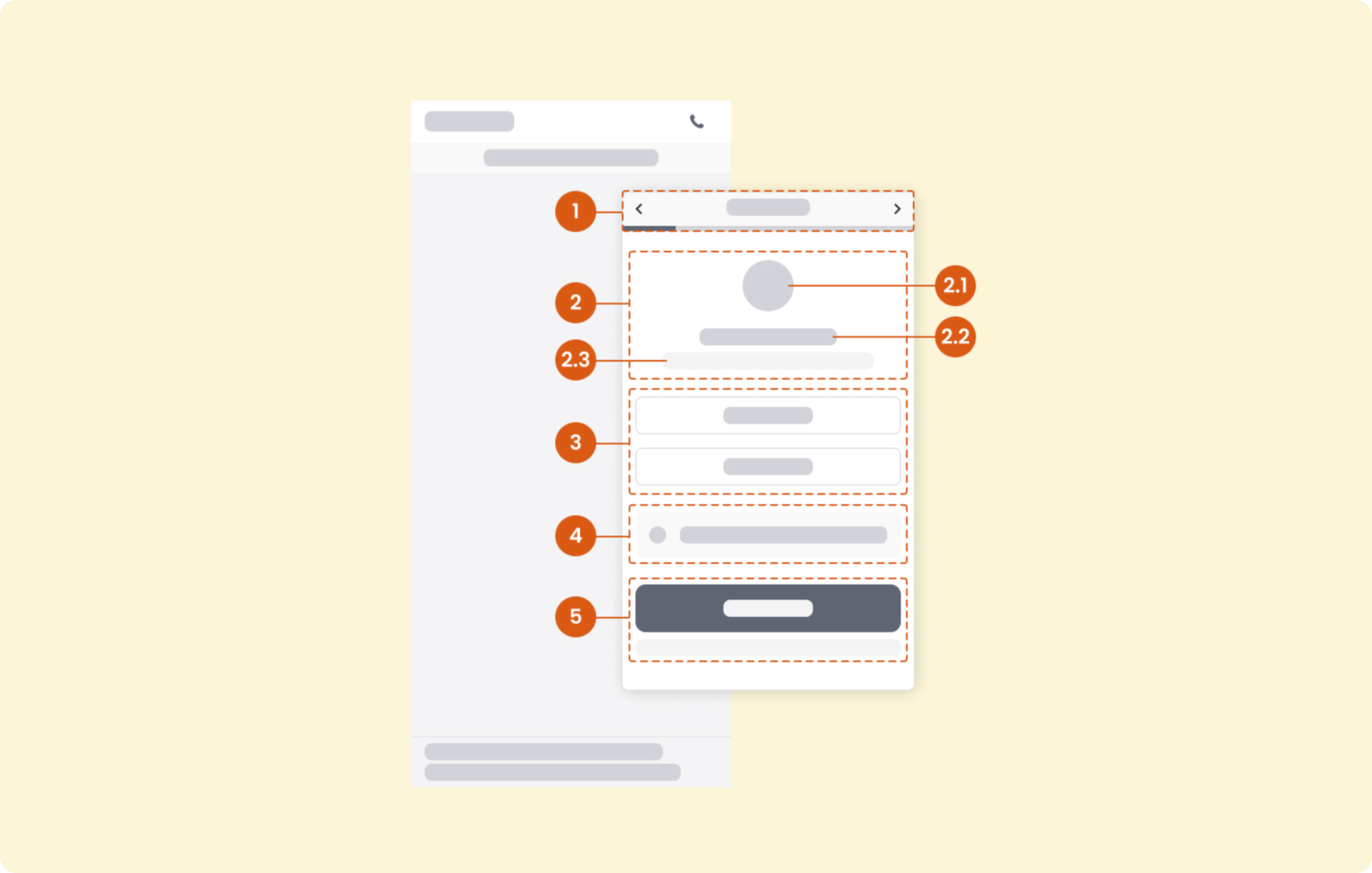
For new components that didn't exist in our UI library, I proposed different solutions and worked with the team to decide the option we wanted to move forward.
Content Design
At the same time, I collaborated with the SEO Content team to improve our editorial content.
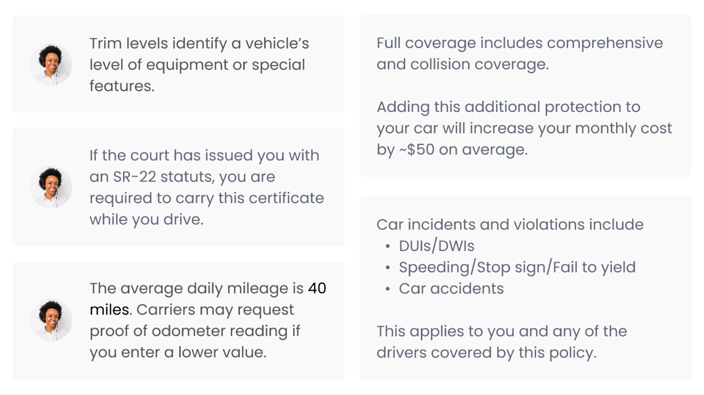
Leveraging the info box element, I added a human touch to provide users with contextual guidance when it is most needed.
I also proposed to add the following messages on the first five screens of the auto flow to build trust with new customers and reduce early dropoffs:
- "Insurify customers save $XXX on average per year" → We help you save money!
- "Insurify is licensed in all 50 U.S. states" → We are a credible company!
- "Insurify works with national brands like Progressive" → We offer quality!
- "Insurify is a woman-led company" → We care about equity!
- "Your data is secured from end to end" → We value data safety and privacy!
Interaction Design
With a focus on usability for mobile users, I improved the interaction on both page- and component-level.
"This is the biggest update I've seen at Insurify in at least two years."
by Dimo, Director of App Growth
—
Outcomes
After three rounds of usability tests with 15 users, we received positive feedback in the following areas:
- Users' perceived completion time is shorter than the actual time
- The top three words users used to describe the experience are "quick/fast," "helpful," and "easy."
- 11 out of 15 users liked the contextual guidance feature
The product team loved the one-question-per-screen layout, enabling Insurify to quickly test new flows and scale.
In June 2022, the Head of Engineering greenlighted this idea and started the re-platform work.
There are two main takeaways from this project:
Moving fast is sometimes not enough. It is an act of art to know when to slow down and be patient.
When business goals clash with customer needs, empathize with both sides. Meet your stakeholders where they are.